ADROBAL
Case
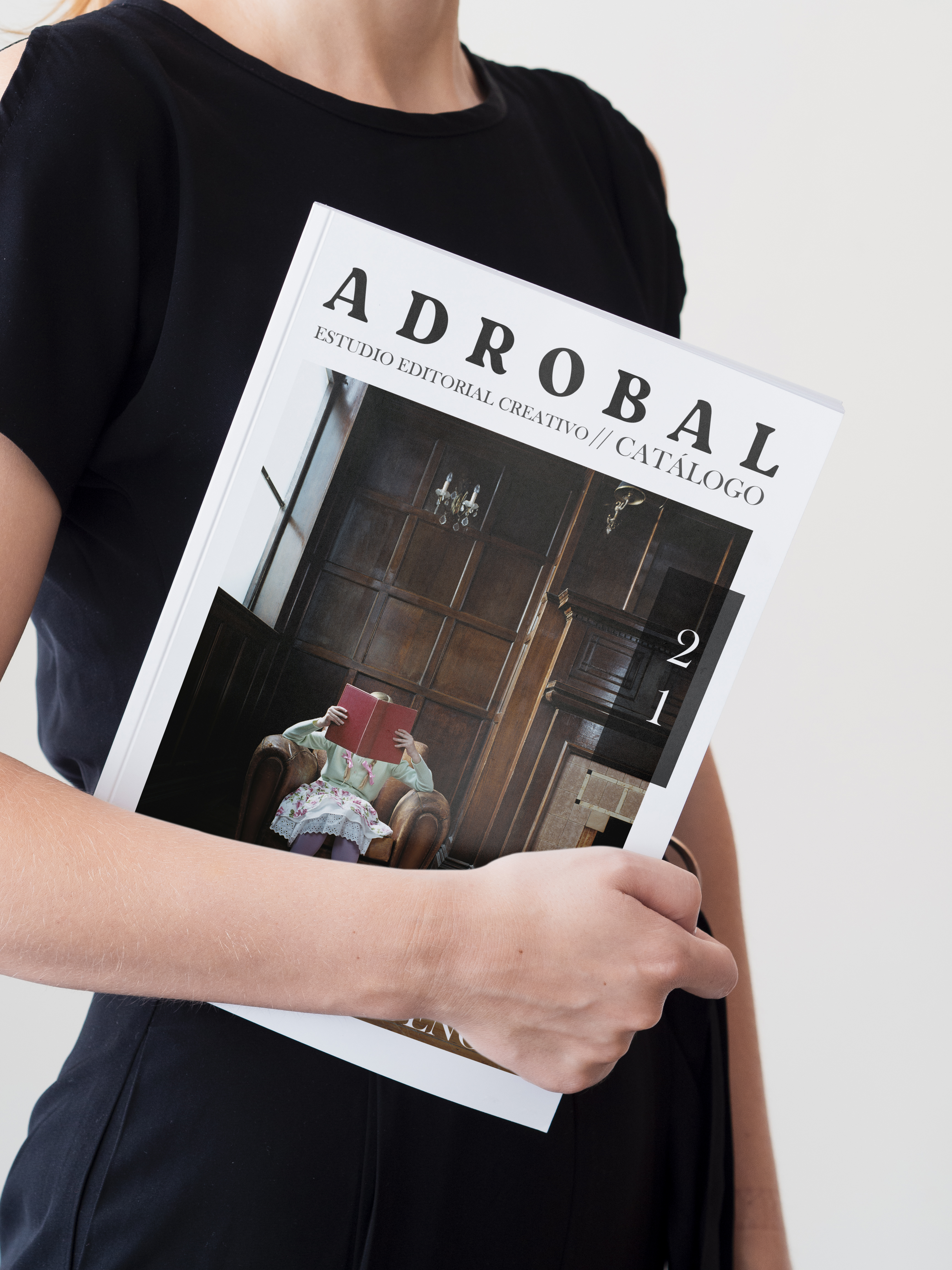
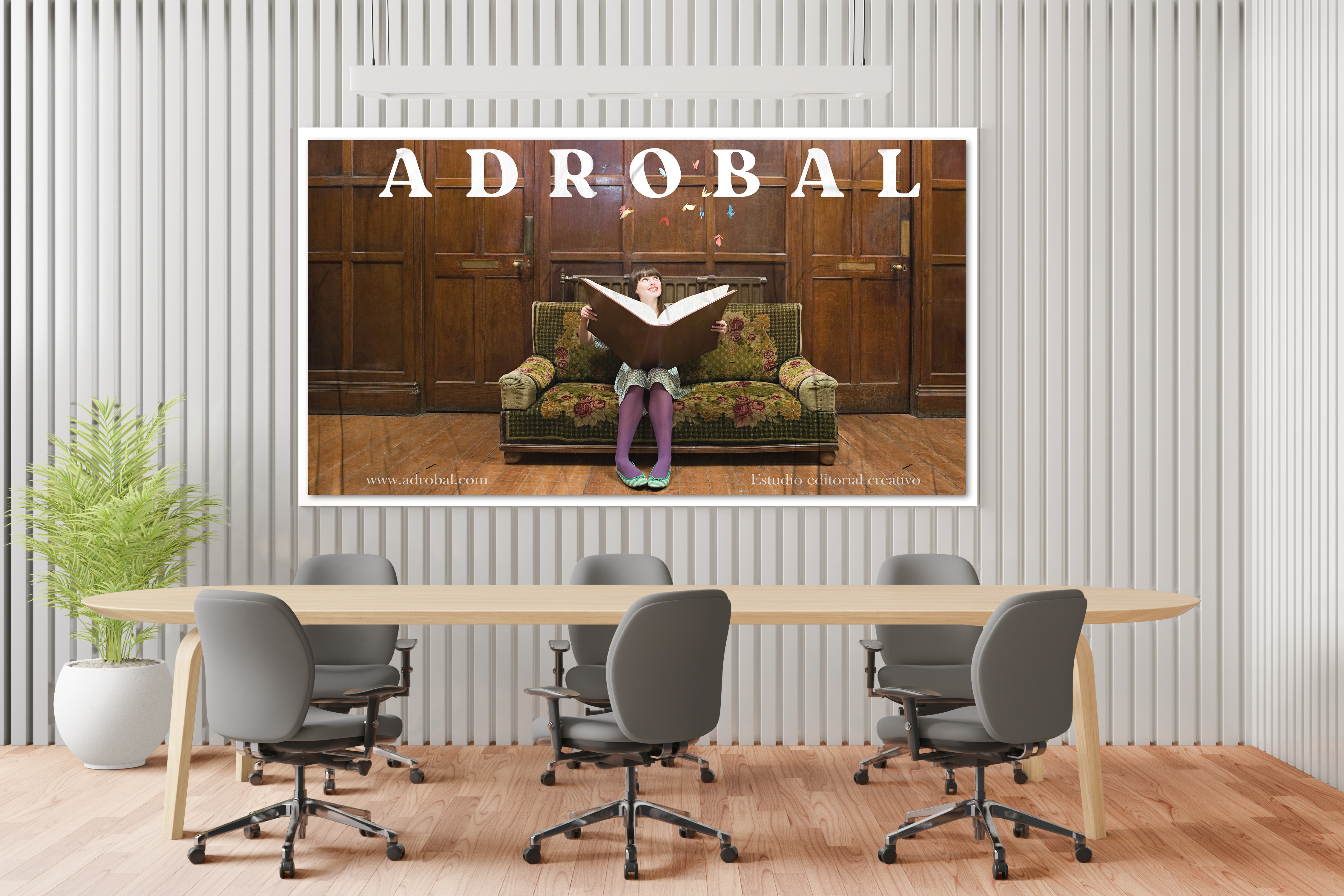
Adrobal is a creative editorial studio based in Madrid focused on the development of publications with personality, through the combination of form and content, text and image, the use of color and the correct choice of fonts, paper and inks. They aim to create unique publications within its genre and the market, in which all the graphic elements are combined in order and harmony with each other and with the content to tell every story through a unique product.
Solution
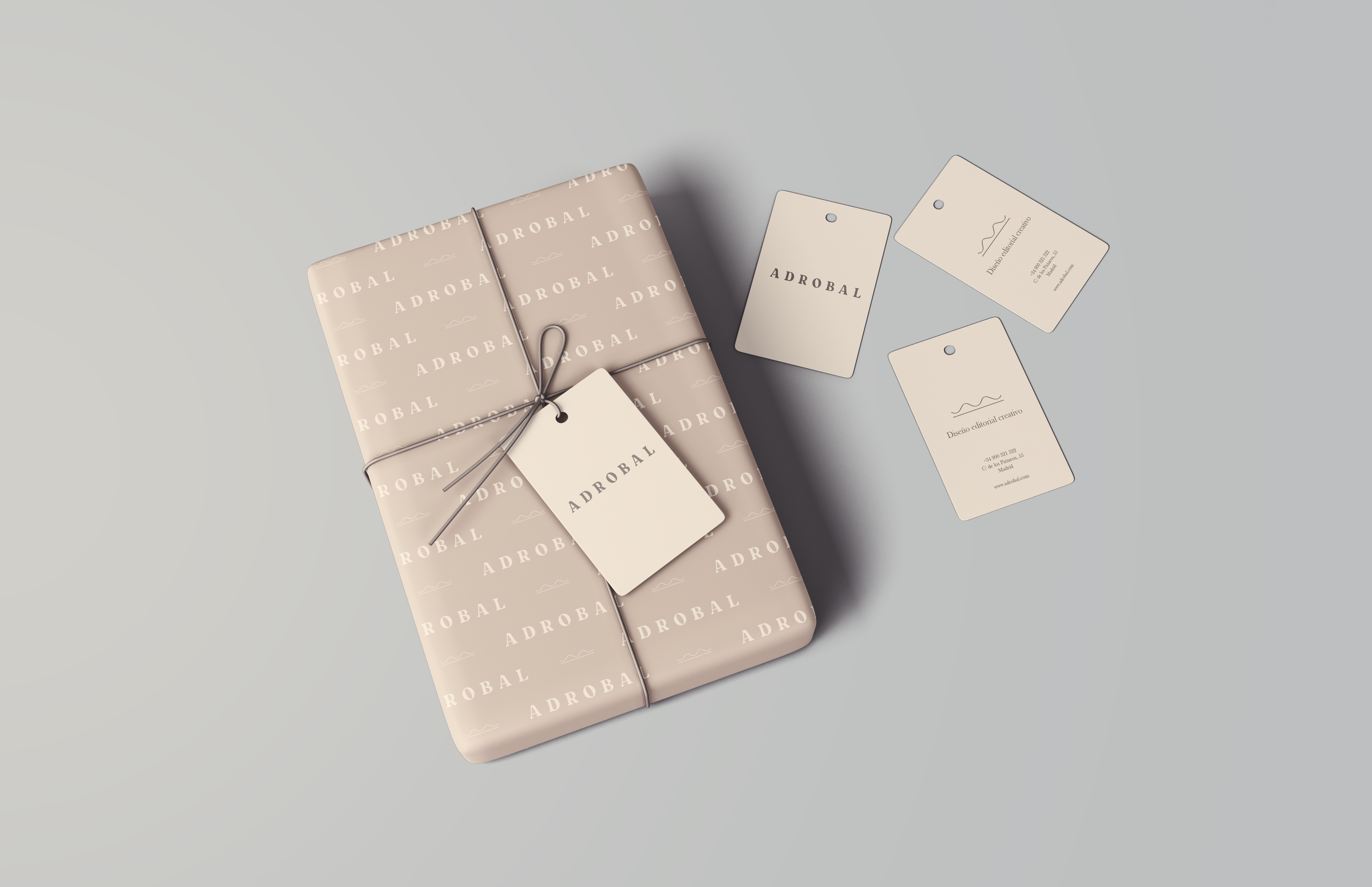
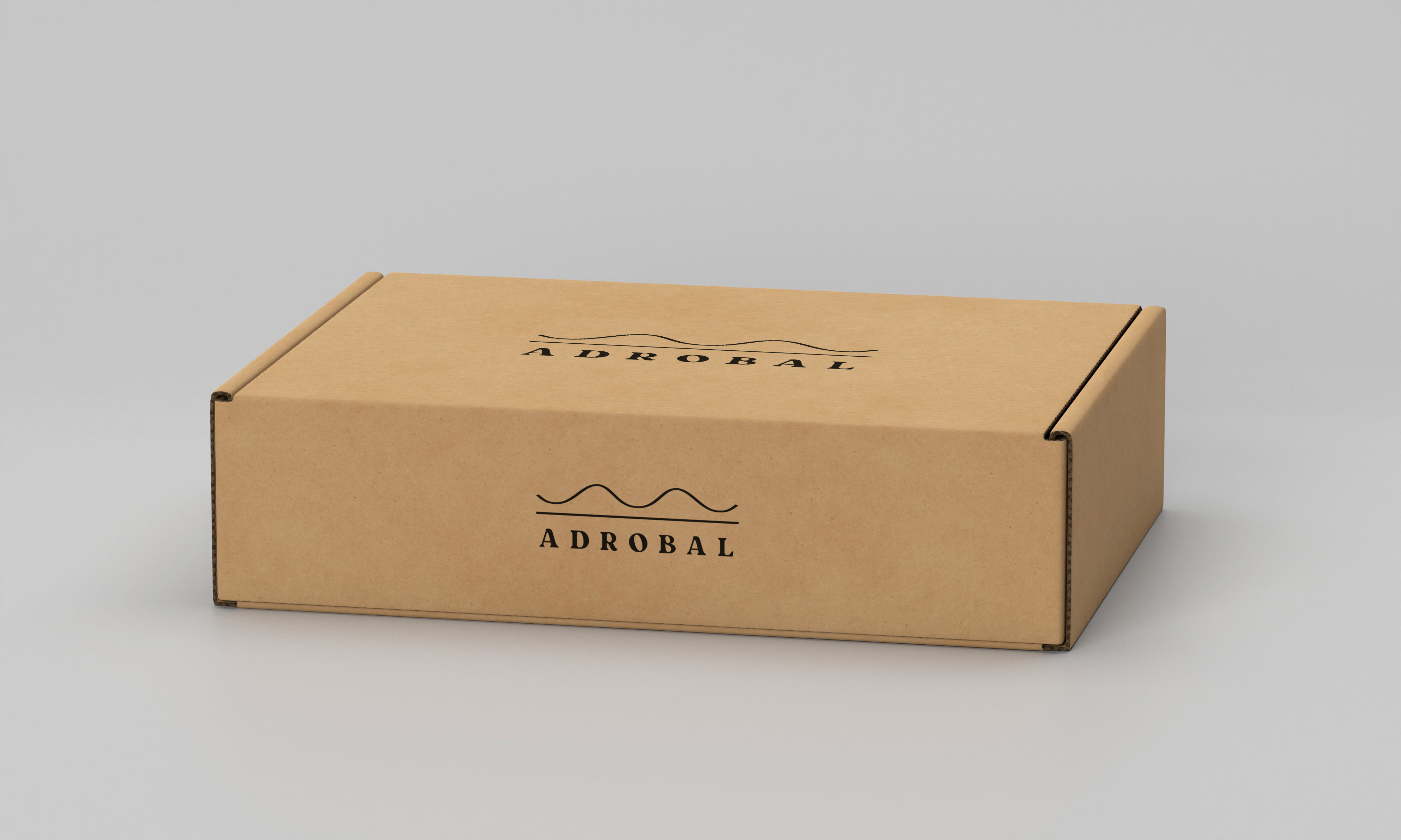
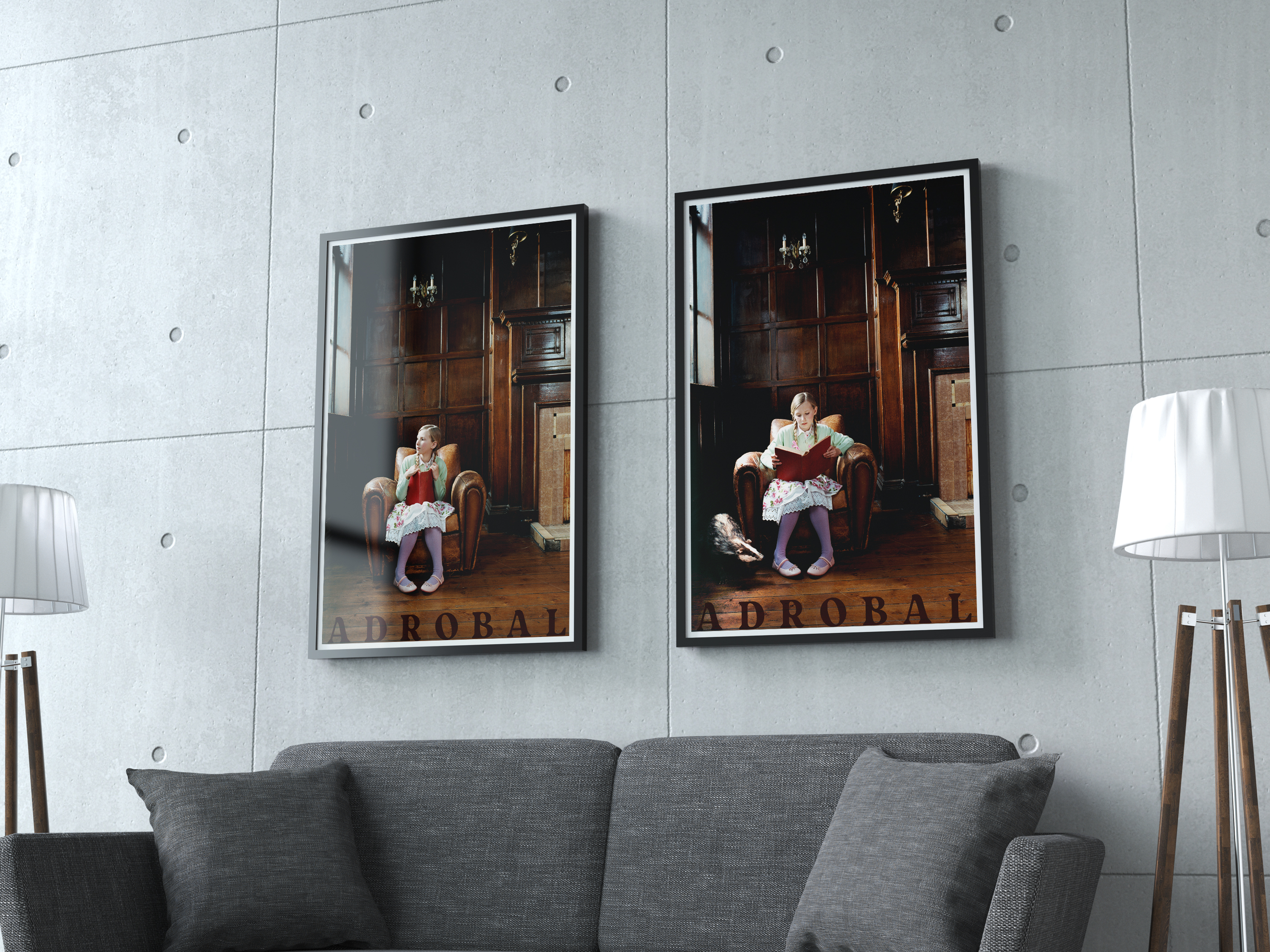
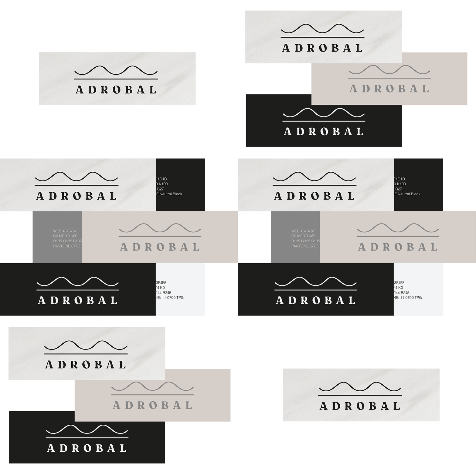
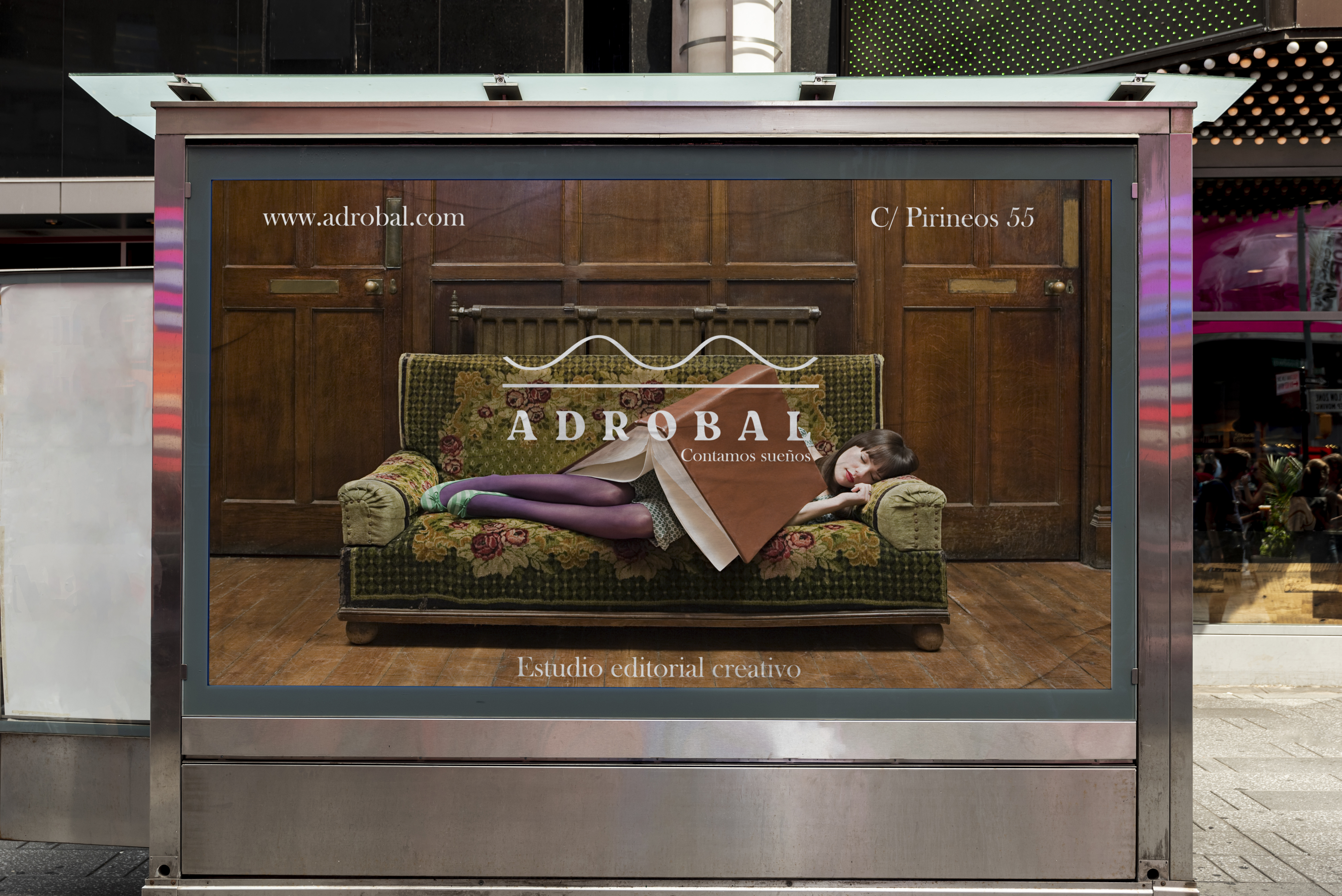
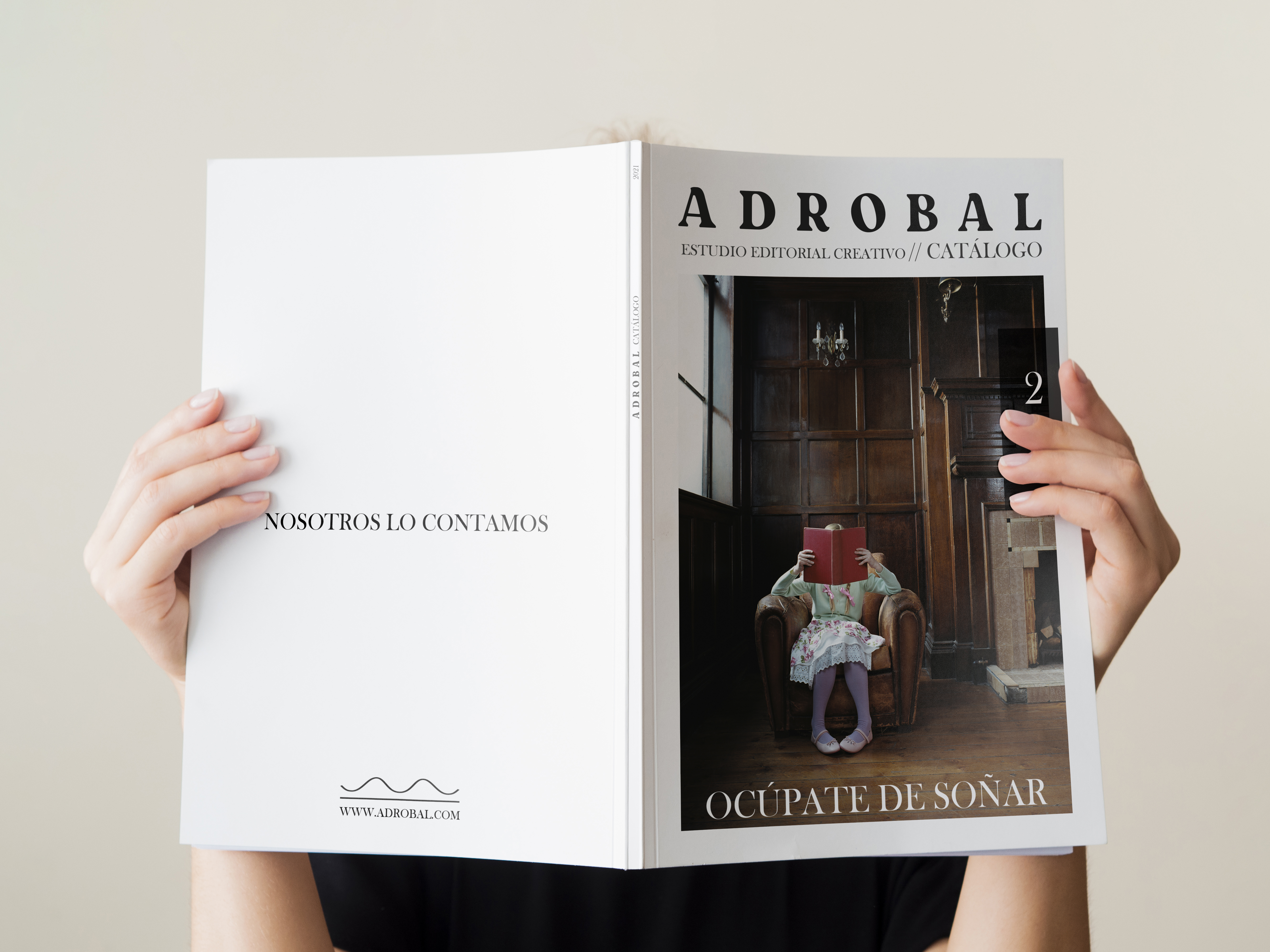
The brand identity's main goal was to convey the company's creativity positioning and its focus on providing unique and long lasting publications. The overall visual design was created to support the clean style and reflect its values. The neutral colors stand as a main design element getting most of the attention: it symbolises elegance, prestige, and cleanliness. Decorative type puts an emphasis on creativity, while the serif type adds a clean and elegant feeling. The isotype symbolises an open book with a relaxed feeling.
Naming · Logo Design · Brand Identity
